I have the last two issues of Medicine at Michigan spread out in front of me. The content is great in the new issue, but the small font crammed into three columns is really unpleasant. The three-column format in the feature articles is like reading an encyclopedia. I can read it. It's just not enjoyable.
I found the larger font with two-column layout to be much more enjoyable to read, and my opinion is that your publication should be a relaxing read. I should say that the graphics in the new design do look good to me.
Jeff Pearson, M.D.
System Medical Director
Department of Pathology and Laboratory Medicine
Bronson Hospital, Kalamazoo, Michigan
Thanks for the feedback. The redesign of Medicine at Michigan is a fairly radical departure from the previous years of the magazine — and our readers have noticed. Some were quite pleased with the changes, but we also heard from some who were concerned with the font size. This issue represents an edit of the initial redesign. You should notice larger fonts that appear bolder on the page, and feature layouts that are easier to read. With our designers, we've tried to make these adjustments while keeping the spirit of the new design.
Patrick Cliff, Editor
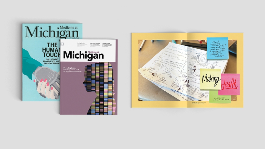
I wanted to reach out and say thank you for the lovely article in the recent edition of Medicine at Michigan, featuring Dr. Joyce Lee and her collaboration on #makehealth. Both Reece and Olivia [U-M patients featured in the article] were especially excited to see the online article. You did a wonderful job on bringing it all together. Thank you again for featuring Dr. Lee and her little makers. We are so proud to be a part of such a wonderful community within U of M and Mott Children's Hospital. Thank you for being part of our lives.
Amy Ohmer
Mother of Reece and Olivia
Owner, Naturally Sweet Sisters